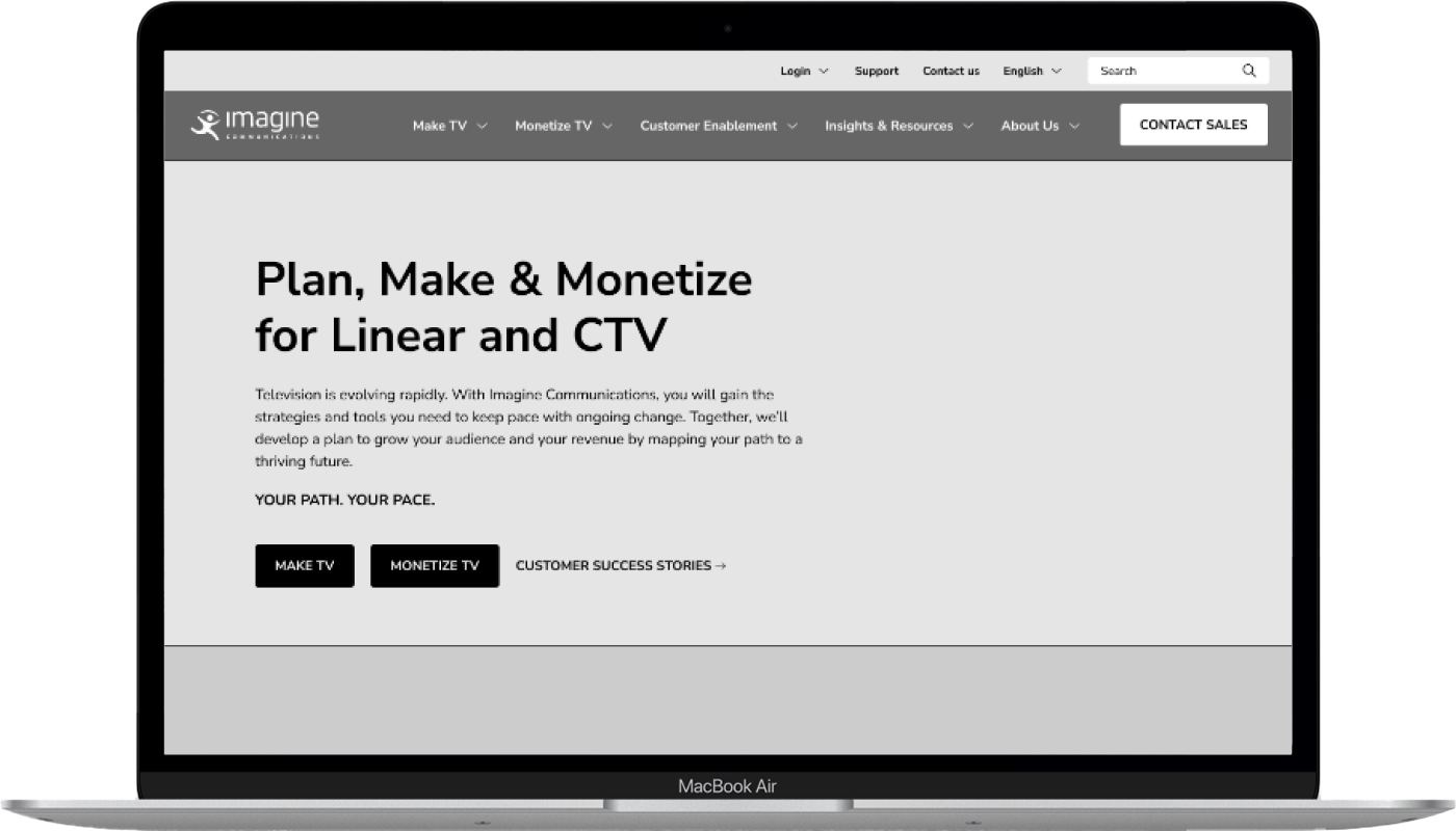
Over time, Imagine Communications’ website had undergone several revisions, leading to a site that was difficult to navigate and lacked clarity in its messaging, proposition, and target audience. The goal of this project was to evolve the website to better serve its audience and help Imagine Communications secure and expand its market share, ensuring the site was fit for purpose over the next 3-5 years.
The Ask
The project followed a gate-based approach, with each stage being thoroughly completed before progressing to the next. My work was concentrated within Gate 2. By this stage, the strategy team had already defined the audience, personas, and overall website strategy. This foundational research set the groundwork for the rebuild.
Gate 2 focused on establishing the website’s user experience; defining the site structure, content, and user flow to ensure it met the goals of each persona while optimising content for CMS integration.
The Output
My focus during this phase was on establishing the site’s structure, prioritising content hierarchy before diving into wireframe designs. By focusing on structural elements early on, we ensured that the website would have a clear, intuitive user flow, and that all future design decisions could be anchored in this framework.
This rationalised approach allowed us to identify key consistencies and differences across page templates, optimising how information was displayed. It streamlined the design process and ensured that each page functioned within a cohesive, user-centric structure.
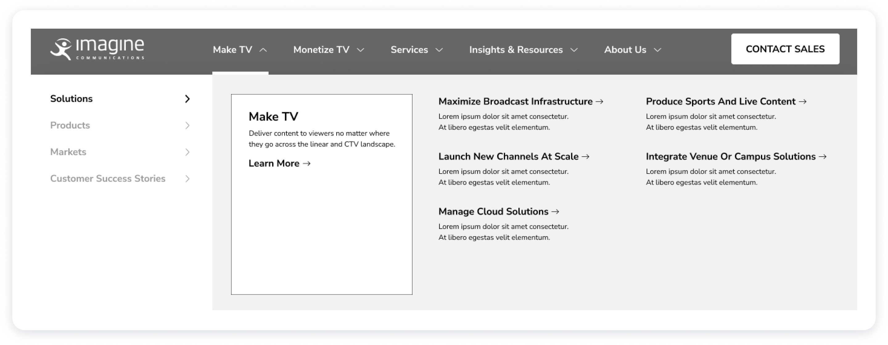
Navigation Structure Redesign
We began by analysing the needs of Imagine’s website users, categorising them into broad persona groups, to create a more user-friendly and relevant navigation system. The goal was to align the navigation with the newly defined solutions and product offerings, while also updating the Services, Resources, and About Us menus to help users achieve the core objectives identified in the website strategy.
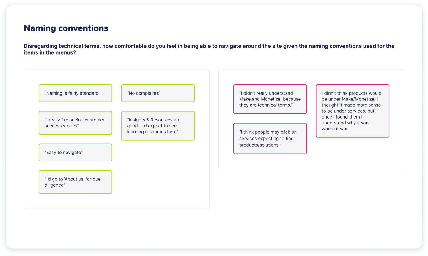
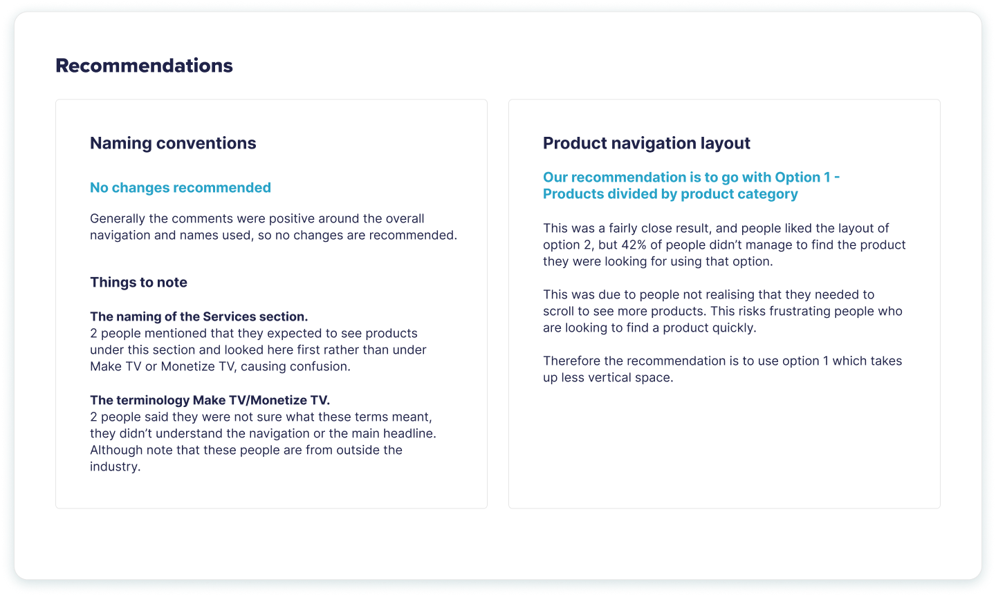
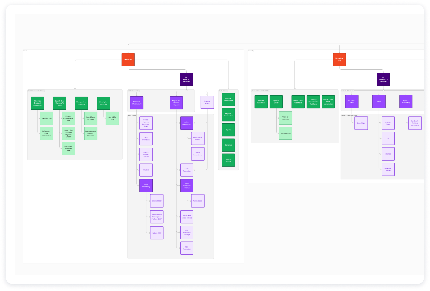
A key improvement involved restructuring the navigation to give each business division within Imagine its own top-level section. Within these sections, products and solutions were clearly separated to improve clarity. One important insight that emerged from our initial research was that Imagine’s product names were often difficult to understand and caused confusion. To address this, we opted not only to list the product names but also to include brief descriptions for each, helping users quickly identify the most relevant options.
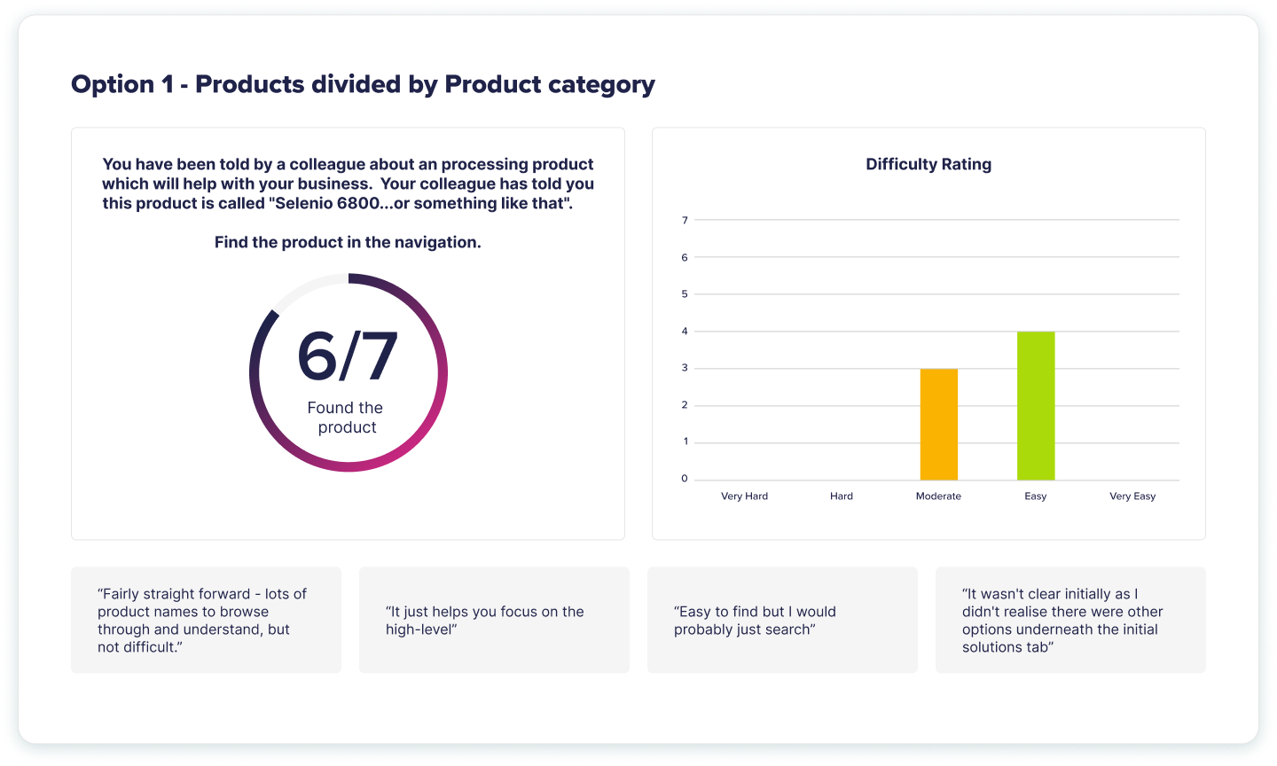
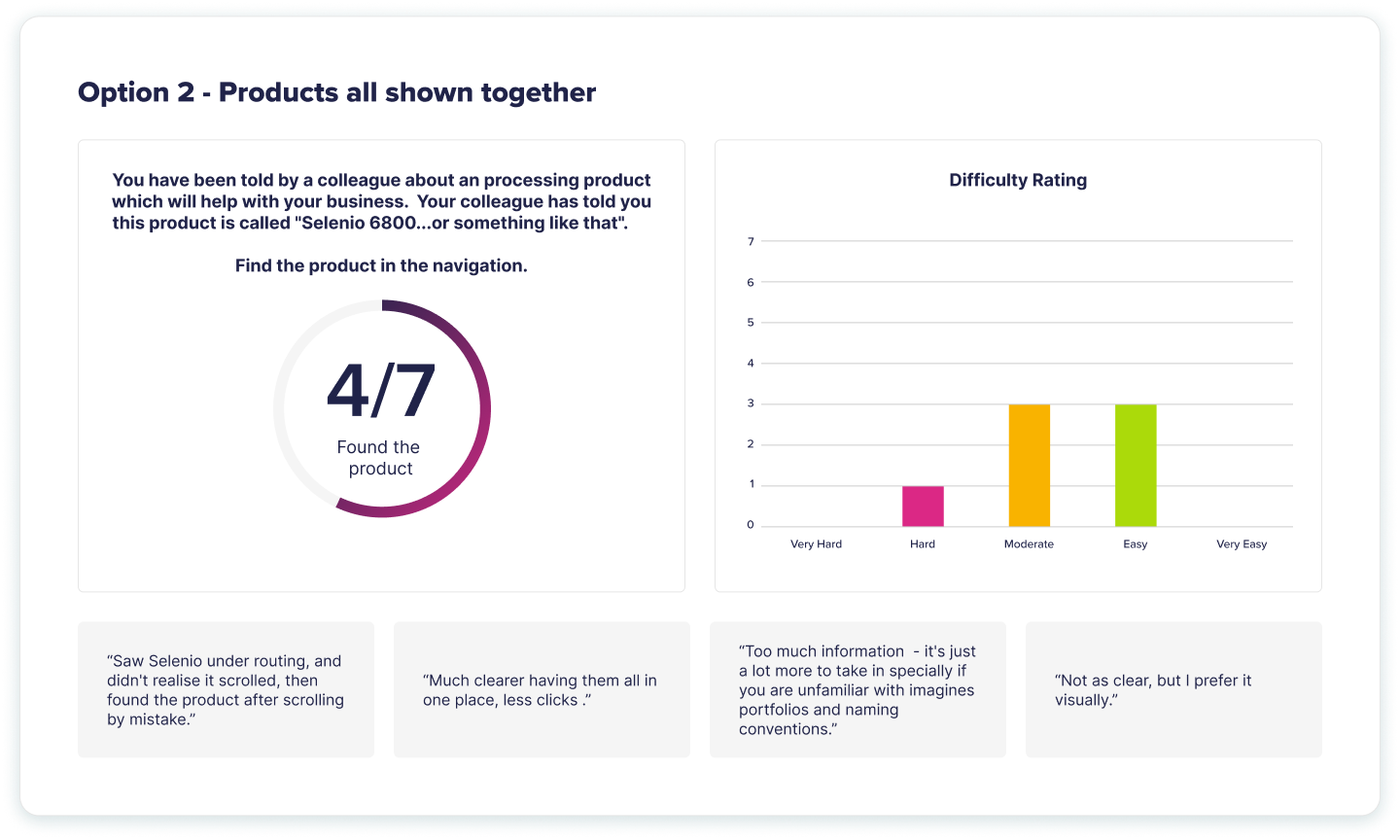
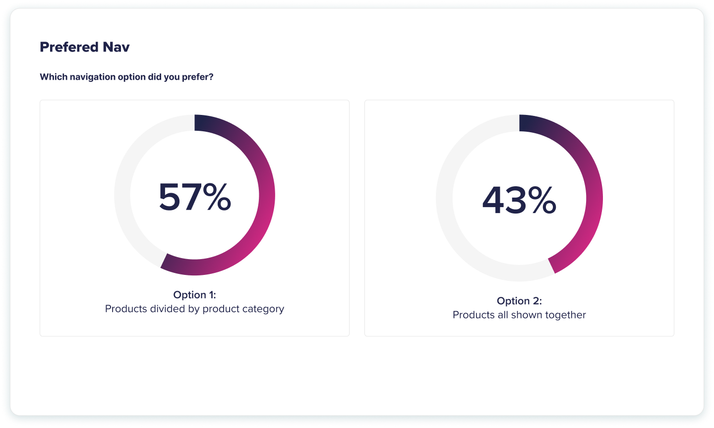
A significant challenge was determining how to group products and solutions, as the structure changed several times during the process. To address this, we designed two versions of the navigation for user testing to ensure we chose the best option.
The remaining sections of the website, Services, Insights & Resources, and About Us, were streamlined and organised to ensure easy access to important content. Additionally, each top-level navigation category featured a breakout box designed to highlight the latest information, products, or events, keeping the site dynamic and ensuring users could easily find new or updated content.
User Testing
While defining the navigation structure, we encountered differing opinions on how the products should be grouped and displayed. To resolve this, we conducted user testing on both options. Each was set up as a clickable prototype, and users were asked to find specific products or information. They recorded their thoughts as they navigated, and results were scored based on whether they successfully found the items. This allowed us to make a data-driven decision rather than one based on personal preference.
Site Map Development
Using our finalised product and solution mapping from the navigation, we created a new site map to clearly outline where each page would sit. This helped us communicate the structure to the client and allowed us to begin grouping pages into templates.
Given that the site would be built on a CMS, we aimed to optimise template use. Pages were colour-coded to indicate which template would be applied, this also informed the development of the content structures.
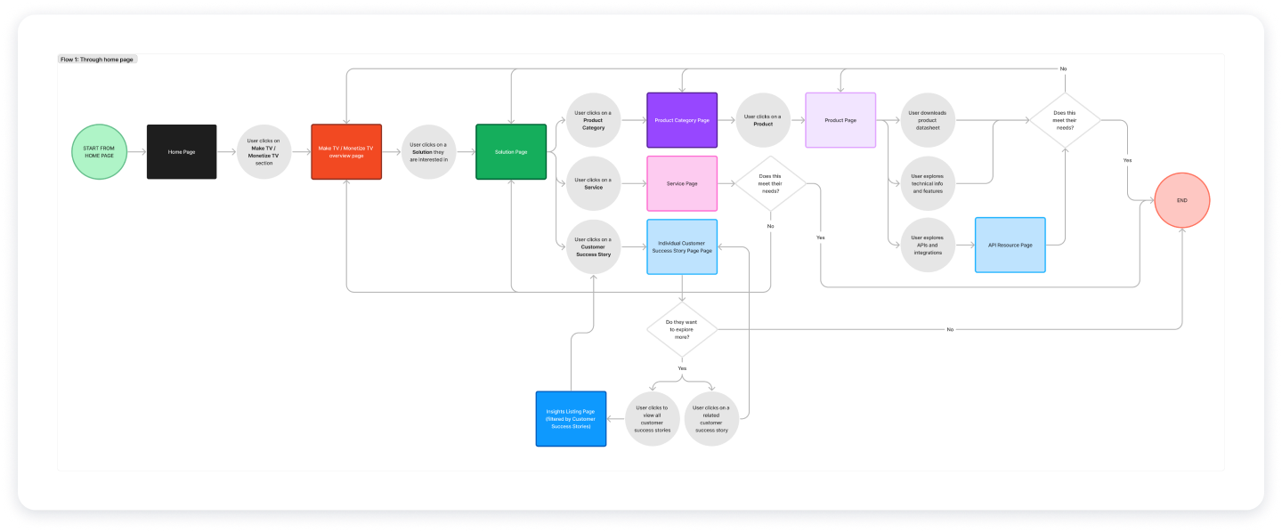
User flows
A major issue with Imagine Communications’ old site was the lack of clear pathways, most pages led to dead ends with no obvious next step. To address this, we mapped out the main user journeys, ensuring each pathway was logical and allowed users to continue their journey. These flows were based on user stories from the personas, ensuring each journey supported the goals defined in the website strategy.
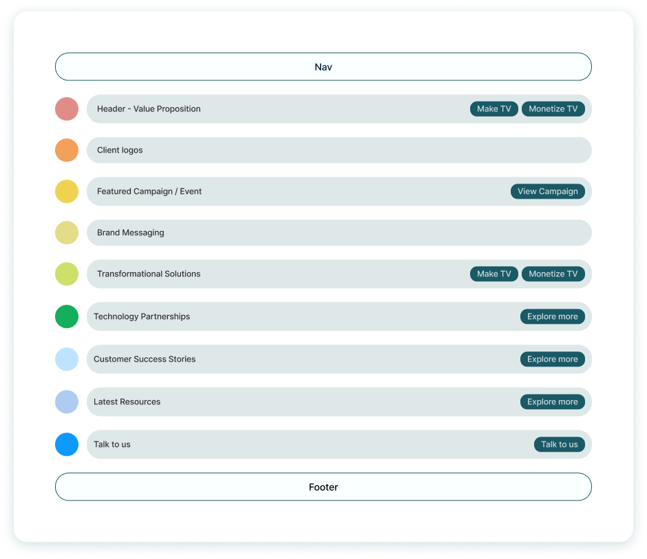
Content Structures
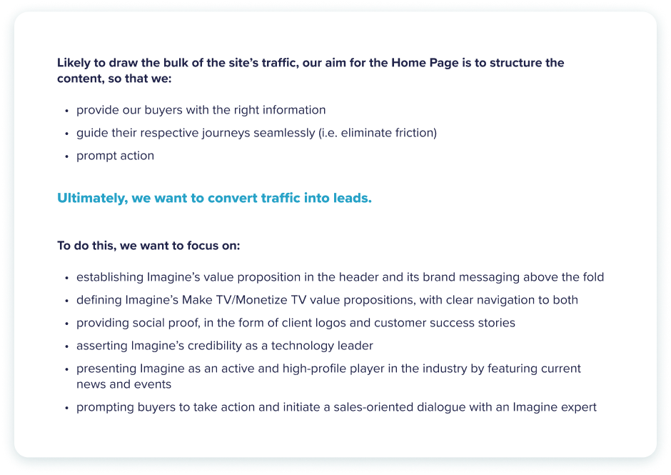
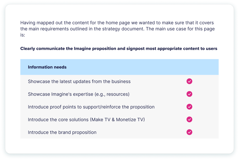
Once the site map and user flows had been defined, we moved on to structuring the content for each main page template. For each page type, we outlined the overall page rationale, the content hierarchy, and the rationale behind each content element. We then validated this structure against the personas to ensure each page met its intended goals.
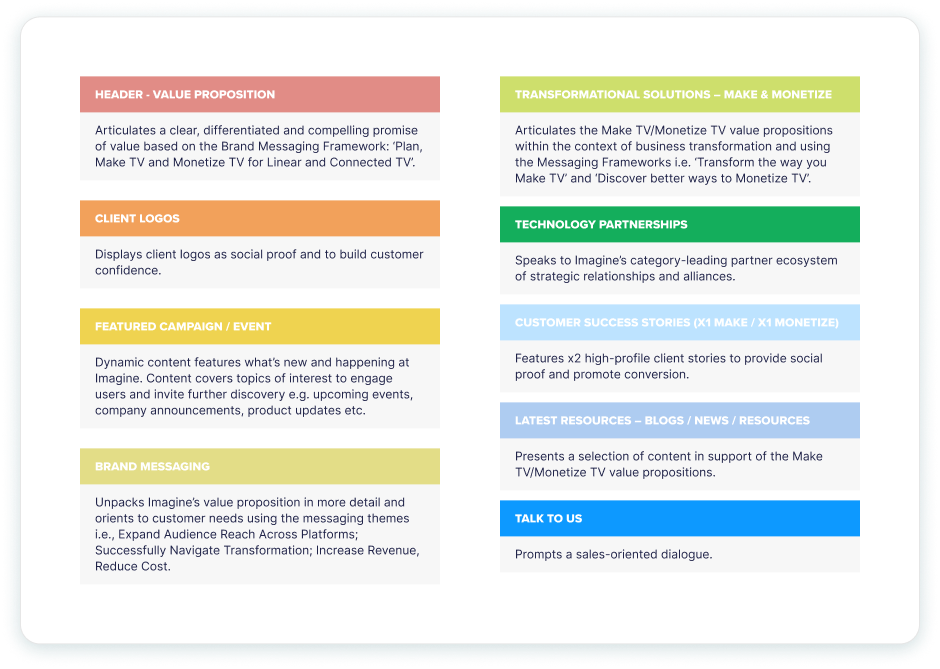
Overall page rationales
Each page type had a clear rationale outlining its focus and purpose. This helped ensure the client understood the page’s objectives and supported the content we defined.
Content order
With the page objectives set, we mapped out the content needed for each page, ordering it by importance and aligning it with the page’s goals. We also identified the main call-to-action for each content piece. These structures were a collaborative effort between UX, copy, and strategy teams.
Content rationale
Each content element was given a rationale to help the client understand its purpose and relevance.
Page validation
Finally, each page structure was validated against the website strategy to ensure it was fulfilling the defined goals.
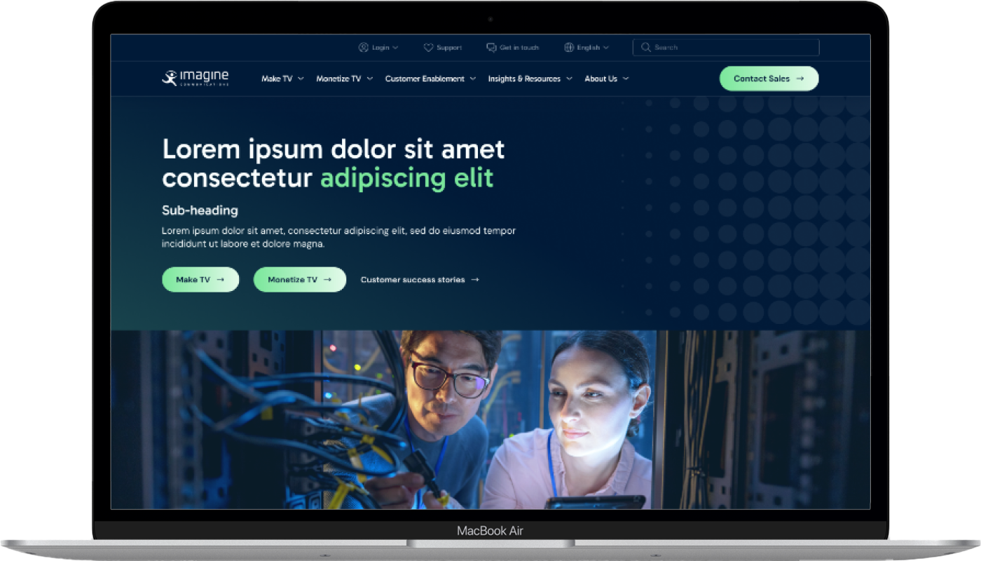
Prototype
With the main structural elements agreed upon, we used the defined content structure to inform the prototype. Each page template was laid out accordingly, and we began defining flexible content layouts that could be used throughout the site. The goal was to ensure each content module was versatile, allowing it to be reused across different pages and sections.
After completing Gate 2, the project moved into Gate 3 with the UI team, followed by the final build and QA stages. Throughout these phases, I continued to consult on user experience-related queries to ensure we maintained the correct focus. The final outcome can be seen below.
Your expertise and guidance have been invaluable. You’ve steered us in the right direction, making the site clearer, more user-friendly, and easier to navigate.
Results
The redesigned site was well-received by Imagine Communications, with the results confirming a significant improvement in user experience. Users spent more time on the site and engaged more deeply, scrolling further down each page. Additionally, traffic to the “About Us” pages saw a substantial increase, indicating that more potential buyers were validating their decision to purchase from Imagine.