(UX/UI) / 2021
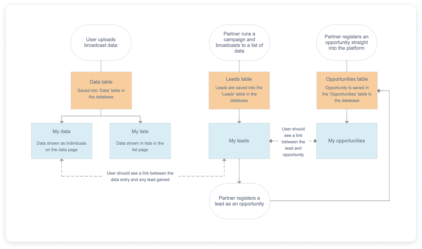
Partnermarketing.com helps partners generate leads through co-branded campaigns via the Campaign Builder tool. The focus of this project was to extend this functionality, enabling partners to register these leads as opportunities with the vendor directly within the platform.
While partners could already generate leads through Campaign Builder, the workflow ended there. To register a lead as an opportunity, they had to manually download lead information and complete the process through a separate system.
This disconnect created a fragmented experience: leads and opportunities were never truly linked, valuable context was lost, and partners had to spend extra time managing data across systems. For vendors, this also meant reduced visibility into lead progression and fewer opportunities being formally registered.
We expanded the platform to allow partners to register leads as opportunities directly within partnermarketing.com. This new workflow connected lead generation and opportunity registration into a single streamlined process.
The change enabled both partners and vendors to track and monitor the status of leads, ensured timely follow-up with relevant content, and ultimately aimed to increase opportunity registration rates. The outcome was not just a smoother partner experience, but also a stronger demonstration of ROI for partner marketing activities.
My input covered both the UX and UI phases of the project. The result was a fully scoped feature ready for development, which included a detailed scope document, an interactive prototype, and complete UI designs. I also supported the team by translating this information into individual tickets for the development team and played an advisory role throughout the feature’s development. Additionally, I conducted full UAT testing before the feature was released to production.
The initial phase focused on scoping the feature with stakeholders and the development team. I began by mapping out end-to-end workflows that illustrated how a lead would move from Campaign Builder into opportunity registration, including all key decision points and required data handoffs. These workflows became a shared visual reference, helping to bridge the gap between business requirements and technical feasibility.
Working closely with stakeholders, I facilitated discussions to capture priorities, uncover edge cases, and identify potential blockers early. This collaborative process ensured that both partner-facing needs and vendor requirements were represented from the start.
The outcome was a comprehensive scope document that detailed not only the functionality of the feature, but also user flows, data requirements, and system interactions. To make prioritisation clear, we categorised requirements using the MoSCoW framework (Must have, Should have, Could have, Won’t have). This gave the project team a structured way to align on what needed to be delivered at launch versus what could be phased into later releases, reducing the risk of scope creep.
This scoping phase provided a solid foundation for the project: it aligned stakeholders, gave developers clear specifications to work from, and set realistic expectations for delivery.
In parallel with the scope document, I developed an interactive prototype in Axure to bring the workflows to life. While the scope document captured the requirements in detail, the prototype provided a tangible, clickable experience of the end-to-end process. This dual approach gave both the internal team and stakeholders two complementary perspectives: the written “what” and the visual “how.”
For the internal team, the prototype became a powerful tool to validate assumptions, refine edge cases, and ensure alignment between business goals and technical feasibility. Externally, it served as a discussion piece with existing and prospective clients, allowing us to test whether the feature addressed real-world needs before moving into design and development.
By allowing stakeholders to step through the process themselves, the prototype made the workflows intuitive, surfaced areas for improvement early, and built confidence in the solution. It also created a smoother handoff into the UI design phase, as many interaction details had already been validated through this iterative feedback loop.
With the scope and workflows signed off, I moved into the UI design phase. My priority was to ensure that the new opportunity registration functionality felt like a natural extension of the existing platform, both visually and functionally. To achieve this, I designed directly within the established component library and style guide, maintaining consistency with typography, color, and interaction patterns already familiar to users.
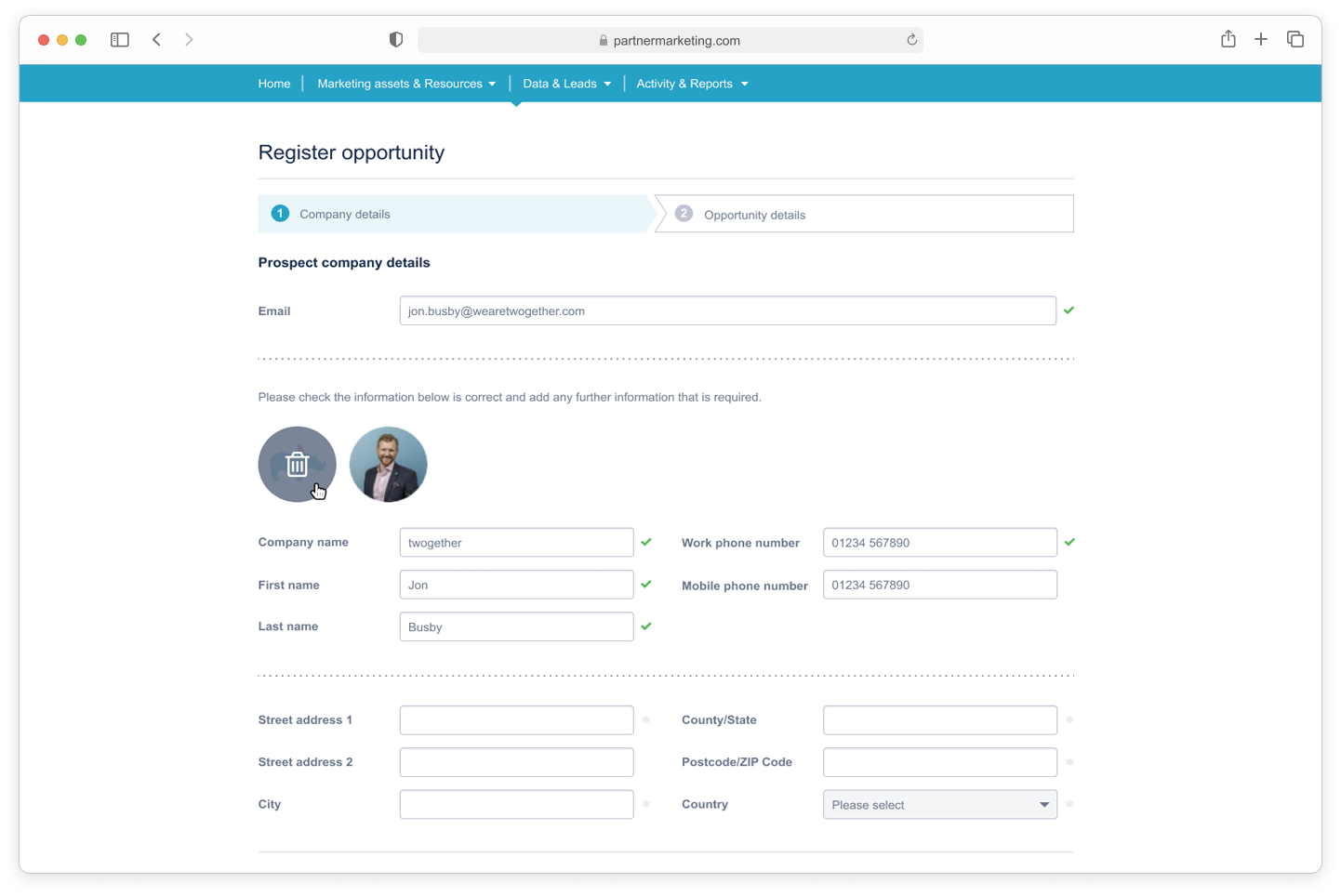
The designs focused on clarity and usability: form layouts were optimized for efficiency, input fields were grouped logically, and validation states were introduced to reduce user errors. I also incorporated subtle visual hierarchy, using spacing and typography to guide users through the process step by step without overwhelming them.
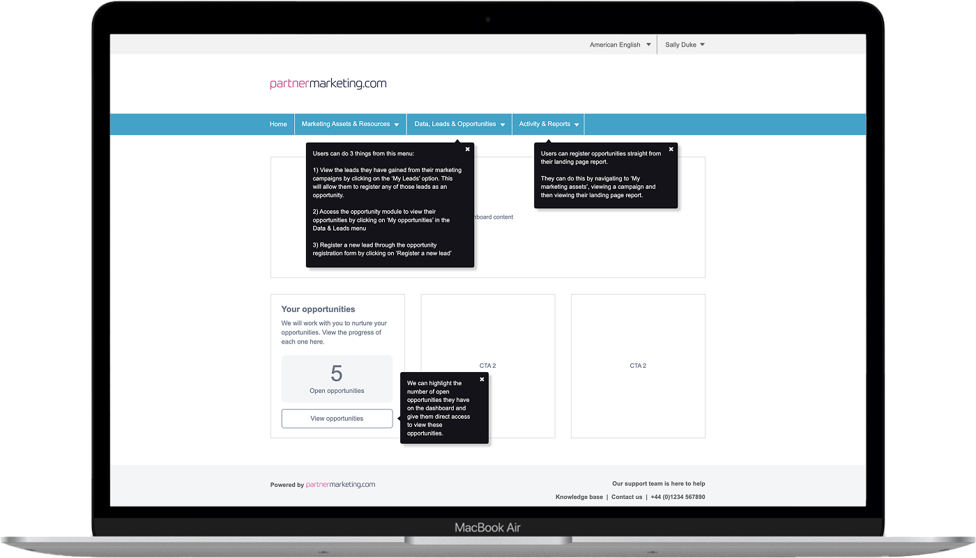
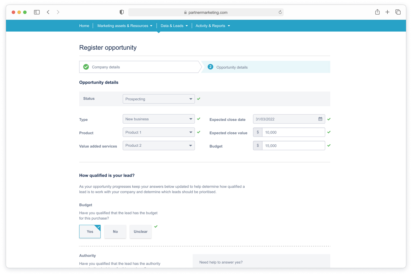
Key screens included:
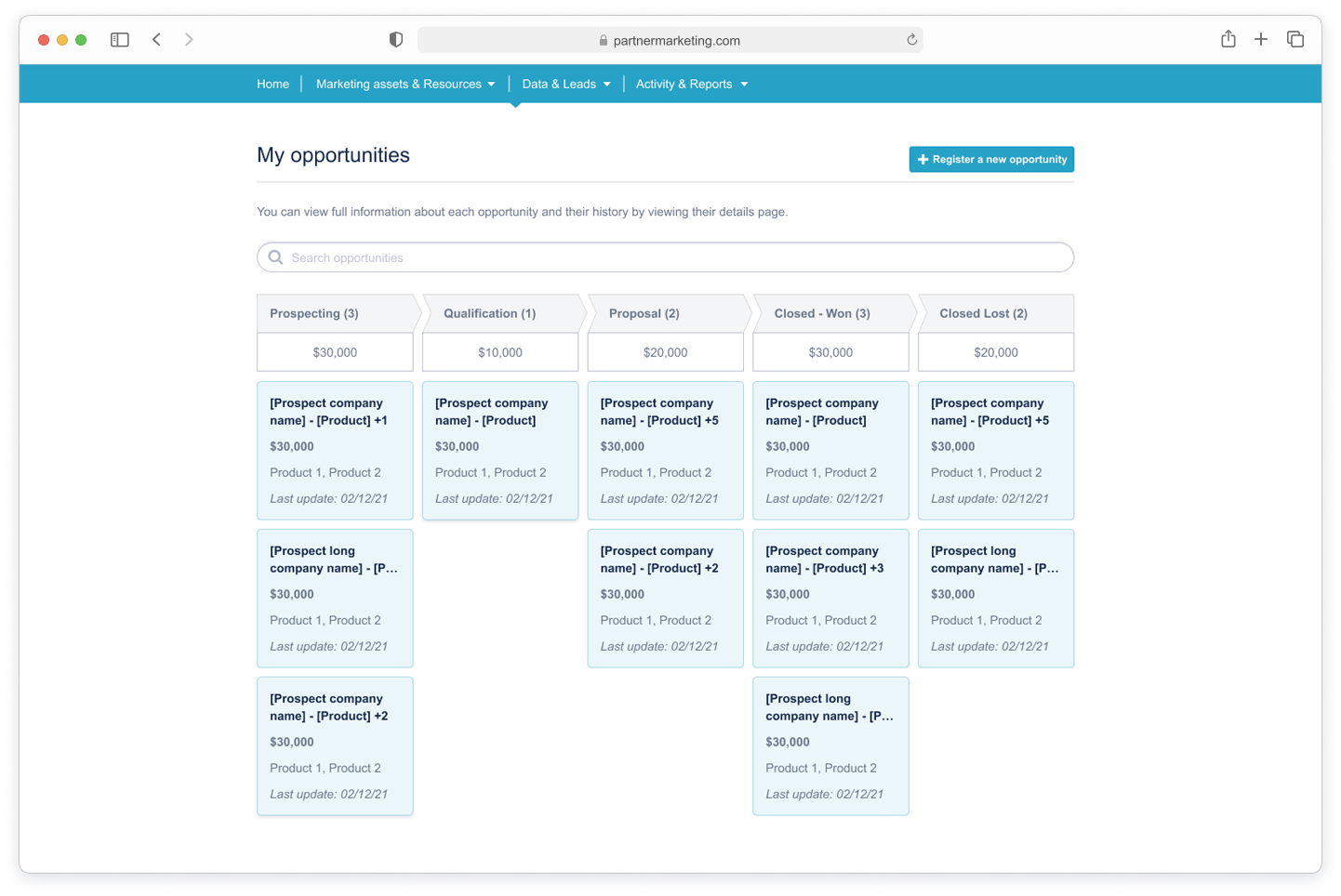
The opportunity registration form, designed with a clean layout that minimized friction and clearly indicated required fields.
The opportunity status view, which allowed partners to monitor the progress of their submissions in real time and gave vendors a reliable overview of activity.
Confirmation and feedback screens, which reinforced successful submissions and provided guidance on next steps.
Beyond static layouts, I paid attention to interaction details, ensuring elements like buttons, error states, and confirmations provided clear, consistent feedback. This helped create a seamless and trustworthy experience that partners could navigate with confidence.
To prepare the designs for development, I documented all specifications in Figma, including component states, spacing, and interaction notes. I also created a structured handoff package for developers, ensuring they had everything needed to implement the feature accurately and efficiently. This approach minimized ambiguity, reduced back-and-forth questions during development, and helped maintain the integrity of the design throughout the build.
Throughout this phase, I collaborated closely with both stakeholders and developers. Regular design reviews ensured business requirements were met, while early feedback from the development team confirmed that proposed UI solutions were feasible within technical constraints. This iterative process helped bridge the gap between design intent and implementation, setting the stage for a smooth build phase.
The feature successfully streamlined opportunity registration, creating a seamless connection between lead generation and opportunity tracking. Partners can now register leads directly within the platform, reducing manual steps and saving significant time.
By integrating this functionality, partners act on leads more quickly, increasing registration rates and overall engagement. Vendors benefit from enhanced visibility into partner activity, enabling timely follow-up and better tracking of pipeline progress.
Beyond efficiency gains, the feature strengthened the overall user experience with a consistent, intuitive, and trustworthy workflow. The combination of well-scoped requirements, interactive prototyping, and polished UI design ensured the solution was functional, user-friendly, aligned with business goals, and led to:
Faster opportunity registration: Partners convert leads directly within the platform, reducing manual steps.
Increased partner engagement: Streamlined workflows encourage timely submissions.
Better visibility for vendors: Real-time tracking improves follow-up and pipeline management.
Enhanced user experience: Intuitive UI ensures ease of use and consistency with the platform.