(UX/UI) / 2023 – 2025
Partnermarketing.com enables partners to utilise co-branded campaigns and assets to support their marketing efforts. However, the process of adding new assets to the platform for partners had become quite time-consuming. The goal of this project was to streamline this process by building a ‘WYSIWYG’ (What You See Is What You Get) interface to allow assets to be added more efficiently.
Adding new content to the platform was labor-intensive. Assets had to be built and coded before being uploaded to the correct campaigns, requiring users to have development or coding skills. This created several challenges:
Bottleneck in content creation: Only users with technical expertise could add assets, slowing down the process.
Inconsistent content rollout: Manual coding introduced variability in how assets were displayed.
Limited accessibility: Non-technical team members were unable to contribute to content creation, restricting flexibility and volume.
To address these challenges, we overhauled the asset creation process with a WYSIWYG interface, allowing users of all skill levels to build new content. The process was structured in two stages:
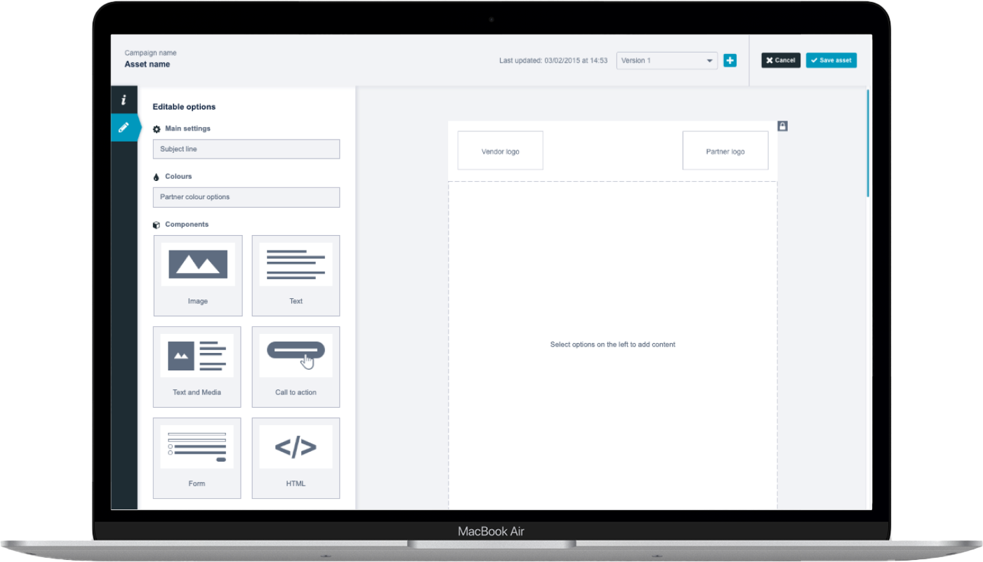
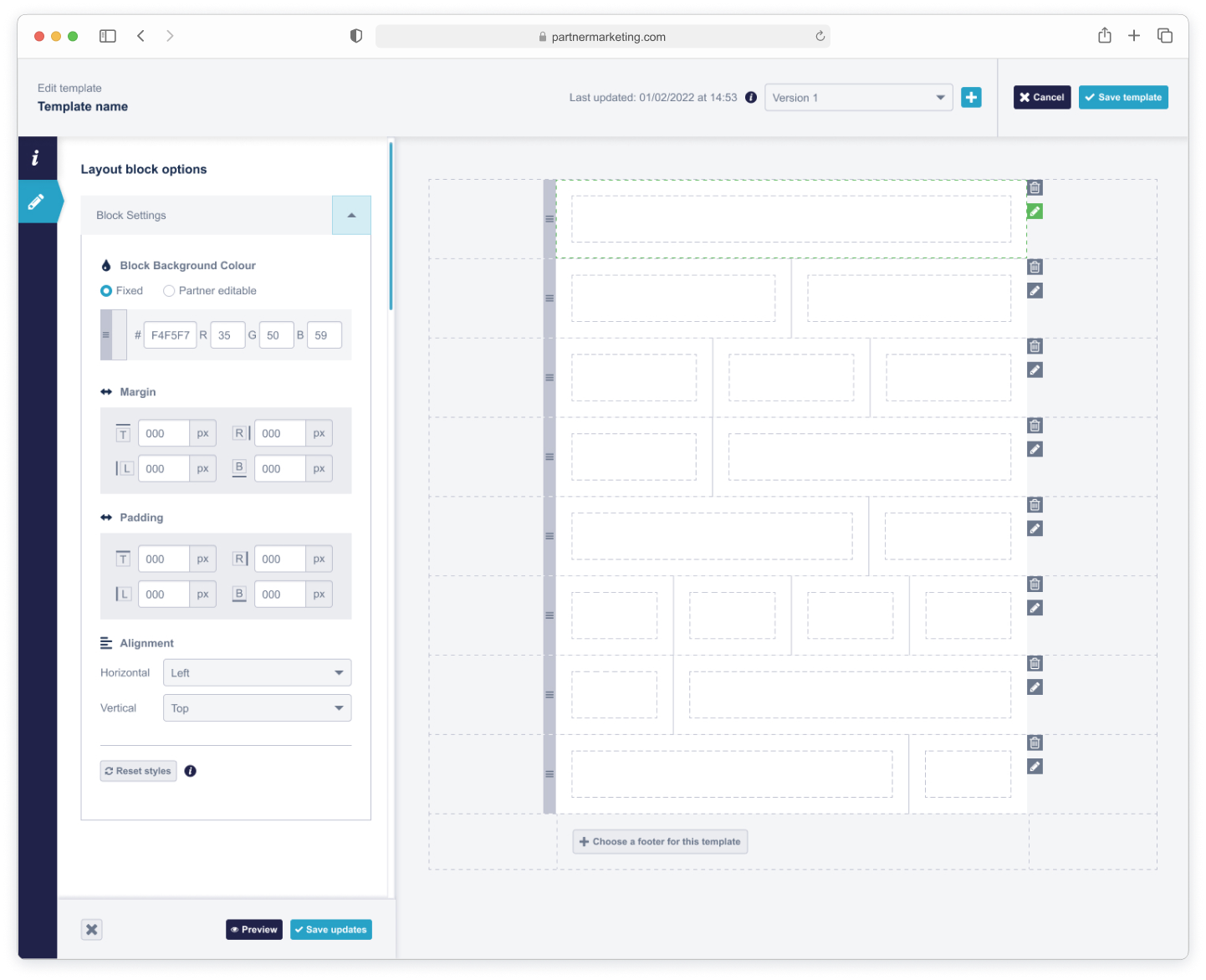
Setup Stage: Users selected and configured the main components to ensure alignment with vendor brand guidelines.
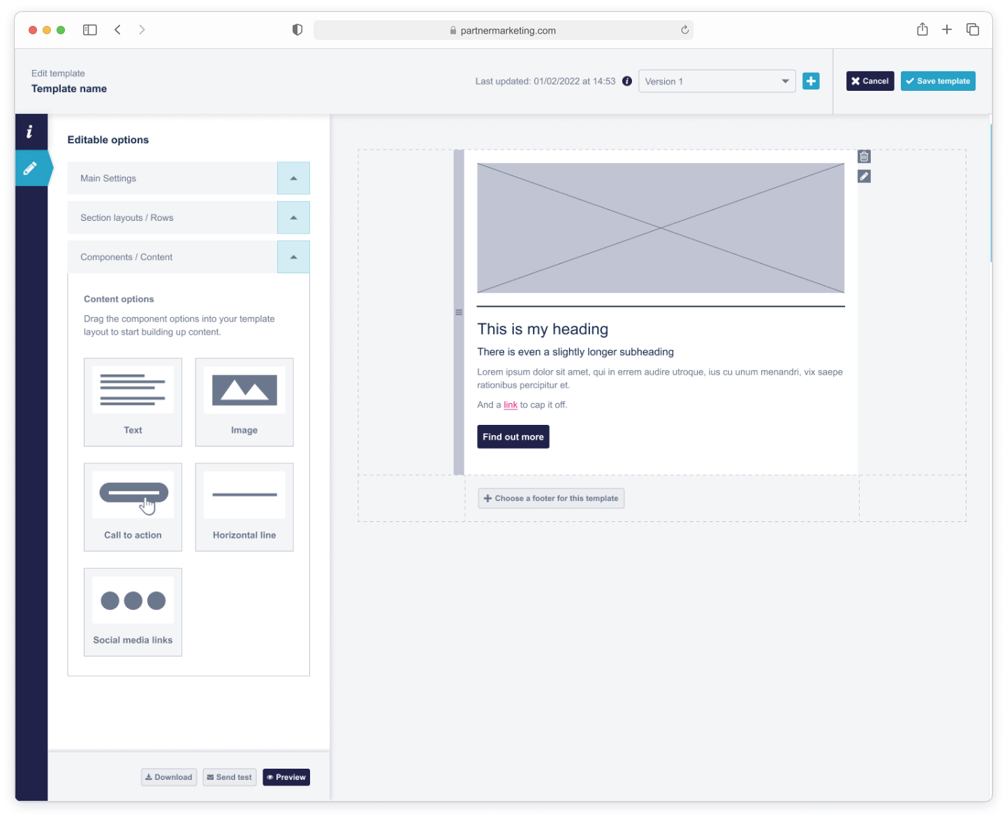
Content Stage: Users added content specific to the campaign, including text, images, and call-to-action elements.
This approach reduced dependency on technical skills, simplified asset creation, and allowed teams to roll out content faster and more consistently.
I contributed to both UX and UI phases of the project. My work included:
Developing a comprehensive scope document, detailing functionality, workflows, requirements, and edge cases.
Building wireframes and an interactive prototype to visualise the end-to-end process and validate workflows with internal teams and clients.
Designing the UI, creating new components where necessary, ensuring adherence to the style guide and component library, and annotating designs for development.
Supporting the team throughout development, providing guidance and addressing questions as an advisor.
Conducting full UAT testing to ensure the feature worked as intended before release.
Writing knowledge base articles to help users understand and adopt the new feature.
The project began with scoping workshops alongside stakeholders and the development team. Together, we created a detailed scope document that clearly outlined the feature’s functionality, data requirements, and user flows. Prioritisation using the MoSCoW framework (Must have, Should have, Could have, Won’t have) ensured alignment and set realistic expectations for delivery.
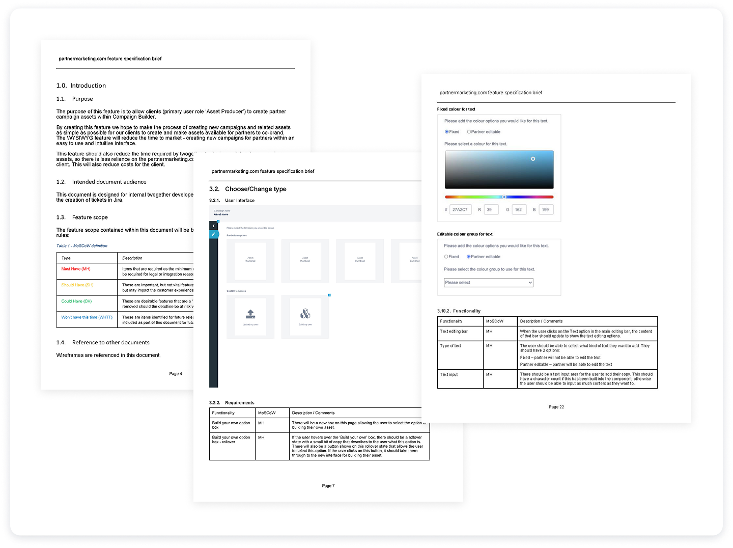
In parallel with the scope document, I developed an interactive prototype. This served multiple purposes:
A visual tool for the internal team to understand the end-to-end process.
A method for validating workflows and interactions before UI design.
A way to gather feedback from existing and prospective clients, ensuring the solution met real-world needs.
The prototype allowed stakeholders to step through the WYSIWYG interface, test different scenarios, and confirm functionality prior to development, reducing the risk of rework.
The UI design phase focused on clarity, consistency, and usability. Key considerations included:
Specifying all element states, including success, error, and informational messages.
Maintaining consistency with the existing style guide and component library, while creating new components where necessary.
Annotating designs in Figma to provide developers with clear specifications for behavior, spacing, and interactions.
Key screens included:
Component setup stage: Users could select and configure branded templates.
Content stage: Users added text, images, and CTAs while seeing a live preview of the final asset.
Validation screens: Confirmed success or highlighted errors in real time, reducing mistakes and frustration.
The combination of a WYSIWYG interface, clear workflows, and consistent UI created a user-friendly experience for both technical and non-technical users.
The final feature enabled anyone, regardless of technical expertise, to add co-branded content to campaigns. This led to:
Faster content creation: Reduced manual coding and bottlenecks.
Increased content availability: More assets for partners to use in campaigns.
Consistency and compliance: Assets aligned with brand guidelines without manual intervention.
Enhanced user experience: Intuitive WYSIWYG interface made asset creation simple and approachable.
Overall, the project improved efficiency, accessibility, and content output, helping partners maximise their marketing efforts while reducing reliance on specialised technical skills.