
(Product Design & Management) / 2026
ROI2Partner is a diagnostic tool that helps partner leaders quantify the time and cost their programme places on partners, turning that into a data-backed business case for change. I joined as a founding member alongside two former colleagues, taking on product and UX from day one; shaping the assessment itself, designing and building the website, and helping define how the three of us worked together as a team.
After decades leading and building partner programmes, my co-founders and I had each seen the same pattern: good intentions buried under growing complexity. Onboarding steps multiplied, certifications expanded, compliance requirements increased, but no one was measuring what that effort actually cost partners. And when partners feel that burden, they make choices: they favour vendors who are easier to work with, and disengage from programmes that ask too much for too little in return.
My challenge was turning that insight into something real: a diagnostic simple enough for a partner leader to complete in minutes, but rigorous enough to produce data they’d trust and act on, built from day one without an existing team, product or process to lean on.
My approach was to design the assessment like a short, guided conversation rather than a lengthy audit: enough structure to generate genuinely defensible data, without asking too much of someone’s time.
There was no existing team or process to build from, so I gave equal weight to defining how we’d work as I did to the product itself: using AI-assisted development to move from design to shipped product without a dedicated design or engineering function, and helping to set up a lightweight way of working so three founders could collaborate with shared visibility over priorities and decisions.
With the challenge defined, I moved into delivery. I started in Figma, wireframing and prototyping the assessment and the website side by side before moving into high-fidelity design, testing Figma’s MCP integration and using a Superpowers plugin to help scope and structure the build. Both the website and the assessment were then built using AI-assisted development in Claude Code, taking the designs through to a shipped product without a dedicated development function. I also built the design system underpinning both, and worked with the team to define the internal process we used to prioritise and collaborate.
Starting from a blank page, we mapped the diagnostic’s structure and question logic first, defining which categories of partner burden to measure, how each response would be scored, and how those scores would roll up into an overall efficiency score and estimated cost per partner.
Early wireframes and clickable prototypes let us test the flow before a line of front-end code was written, making sure the assessment stayed genuinely quick to complete without losing the rigour behind the output: a guided flow that completes in around 10 minutes and produces an instant, executive-ready PDF report.
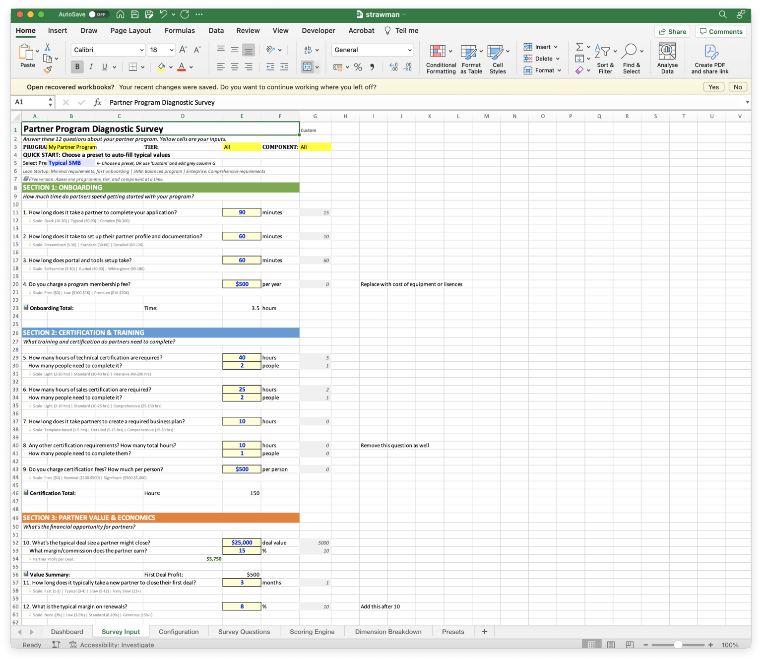
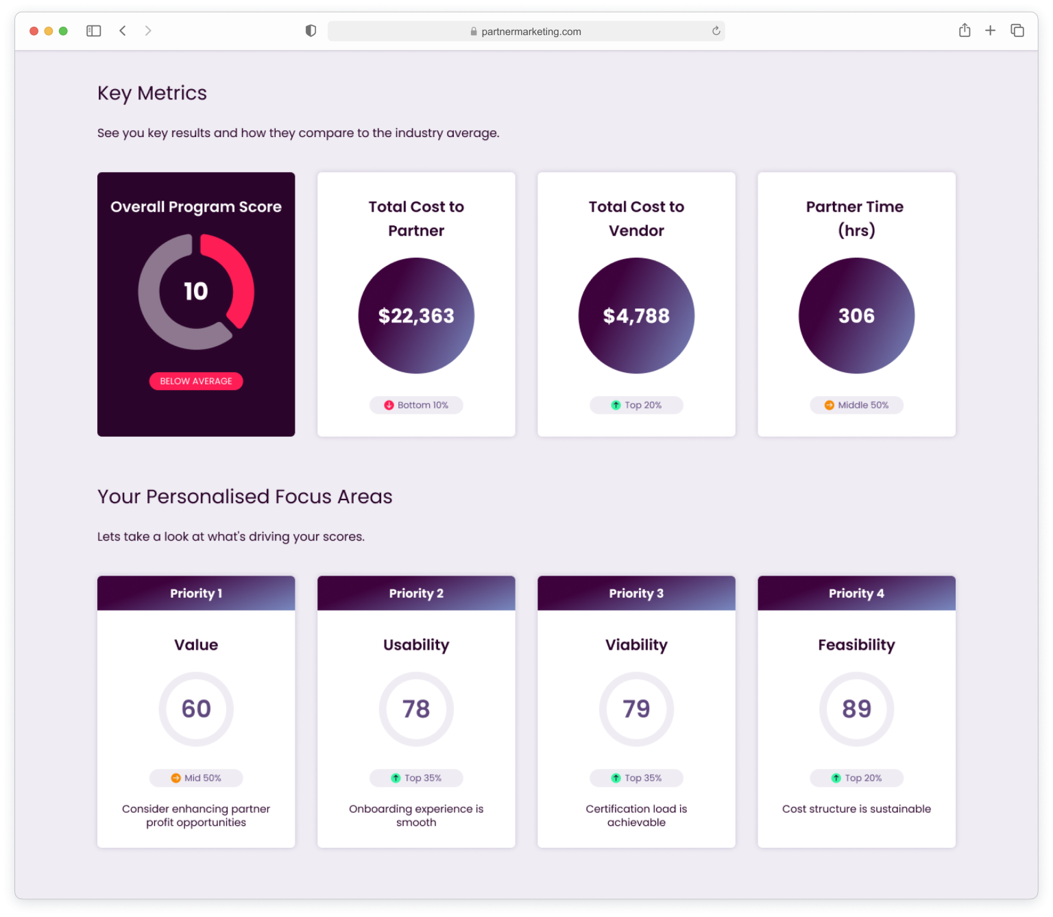
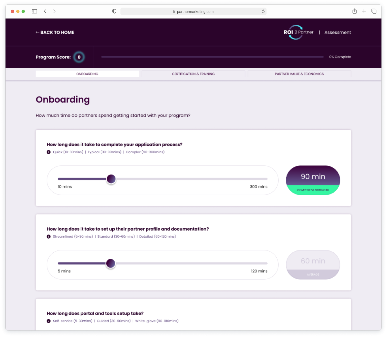
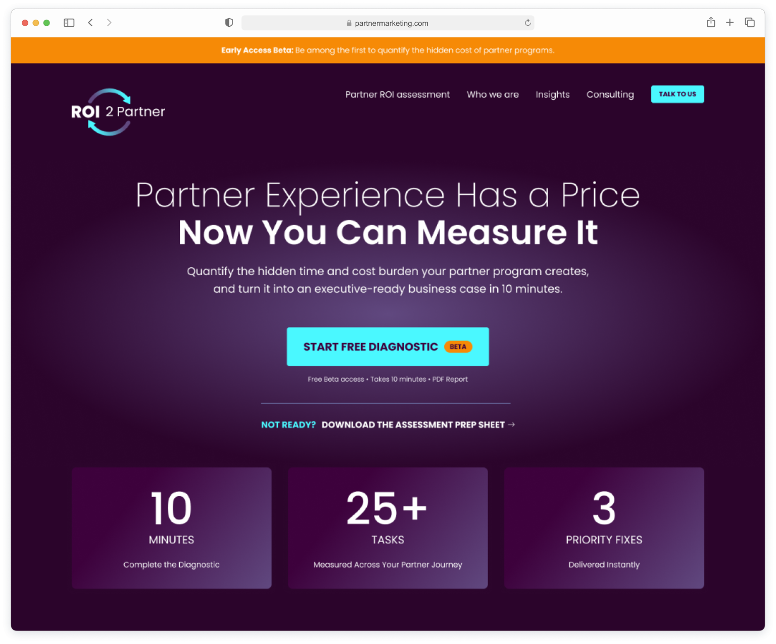
With the diagnostic’s logic defined, I turned to the site that would introduce it to the world. I owned the full UX and UI process: information architecture, content structure, user journeys, wireframes and high-fidelity design, using Claude throughout to help shape content and copy, to explain a genuinely new category (an ROI diagnostic, not another PRM platform or generic survey tool) clearly enough for a partner leader to understand its value within seconds of landing.
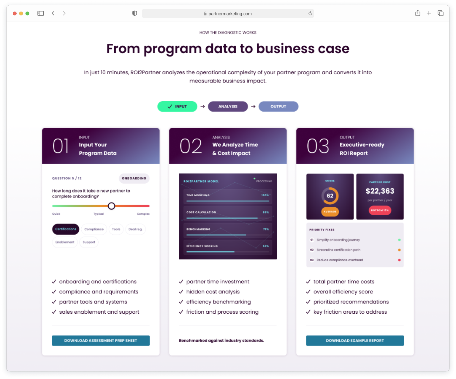
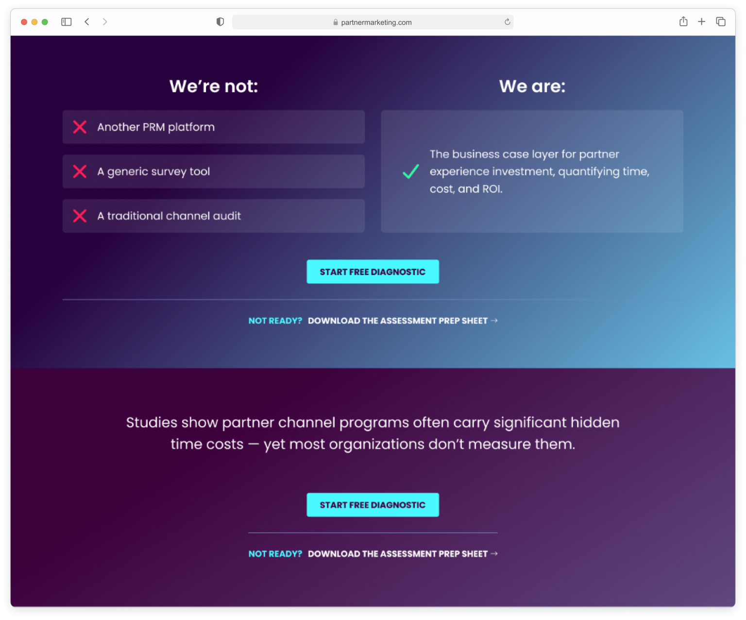
The tools available for AI-assisted design and development changed multiple times over the course of this project, and my process changed with them. I started the designs and the initial design system in Figma. Claude Design hadn’t launched yet, so the website and assessment were built directly in Claude Code, learning the workflow as I built the product. When Claude Design launched partway through, I began using it to prototype and test design updates directly, feeding anything that worked back into the Figma source files to keep them in sync.
By that point, Claude Code had generated a CLAUDE.md file documenting the system as it existed in code. I used that as the starting point to build out a proper design system directly in Claude Code, covering colour, typography, spacing and components as a single source of truth for both the website and the assessment tool, then folded in updates from what I’d been testing in Claude Design, so the file stayed one source of truth across all three tools rather than three versions slowly drifting apart. That CLAUDE.md-as-source-of-truth approach is what let me keep design consistent through several changes in tooling within a matter of months.
Once the initial site and assessment were live, keeping momentum meant defining how the three of us would actually work together as we moved from building to iterating. We adopted a Kanban approach in Linear: a backlog reviewed together each week, issues moved into progress against whoever (or whatever) was picking them up, through to “ready to review” once done, and only marked complete once the rest of the team had signed off.
That flow gave us the flexibility to adapt quickly as we learned more from early users and site visitors, reprioritising the backlog as new information came in rather than working to a fixed roadmap. It also meant we could delegate work beyond the three of us, routing well-scoped issues straight to Claude Code to pick up, review and move through the same board as everyone else’s work.
ROI2Partner is live in Early Access Beta, with the diagnostic already collecting real partner programme data. As the founding team continues to learn from that usage, I’m continuing to own and evolve both the product experience and the website, working with the team to prioritise what gets built next and continuing to refine how Figma, Claude Design and Claude Code fit together in my process.